Berlin’s best post-wall architecture
Sightseeing Beyond Potsdamer Platz and the Government Quarter
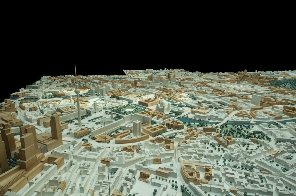
Of course Berlin’s pace of development is nothing compared to big cities in emerging markets in Asia or Africa, but for European standards it was nothing short of staggering. If you look at this model of Berlin’s inner city, everything that is not white has either been built after 1989 or is yet in the future but confirmed.
Some of those projects have become major landmarks like the government buildings north of Brandenburger Tor or Sony’s architectural hommage to Mount Fuji at Potsdamer Platz. Others like the pink monster they call Alexa are less famous than infamous. A lot of other buildings are probably nice to live or work in, but are otherwise unremarkable not to say boring, blocky and evenly patterned concrete fortresses with large windows and small applications that try in vain to suggest character, where there is none. This post is about the other buildings, those that are neither famous nor easily forgettable. Of course this list is highly subjective and incomplete. Basically these are just buildings that I find personally attractive and in one way or another extraordinary. I’m not an architect, nor a historian or anything else that would qualify me to make any judgement. So if you don’t agree, please join the discussion and I’m happy to include your suggestions for more buildings that I simply missed or forgot. But for now, I’d like to take you on a rather personal sightseeing tour to my favorite buildings that are not yet part of the standard Berlin itinerary.
Jacob und Wilhelm-Grimm-Zentrum, Max Dudler
| Location: | Geschwister-Scholl-Straße 1-3 |
| Purpose: | University library, Humboldt Universität |
| Architect: | Max Dudler |
| Completed in: | 2009 |
| Acreage: | 20.000 m2 |
I picked this one, mainly for it’s interior. The architect Max Dudler is highly awarded and something of a specialist for public buildings. His experience includes a couple of other library buildings and the Total Tower at Berlins Hauptbahnhof. And if you know that one, you might have an idea where I have a problem. His facades tend to be super-blocky and even combinations of natural stone and rather narrow windows. Well, there is nothing wrong with a little structure and order but I have to admit this bores me tremendously, especially when the overall shape of a building is just huge rectangular cube without anything breaking the outlines. This is something a lot of architects love who are influenced by the Bauhaus school (and they all are): form follows function and a cube is not only the cheapest to build but the easiest to divide as well. Anyway, here we go.
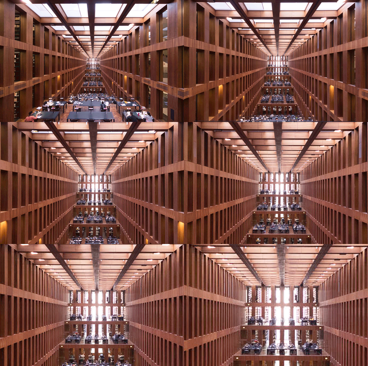
Atrium/work area at the central library of Humboldt University; Jacob- und Wilhelm-Grimm Zentrum in Mitte
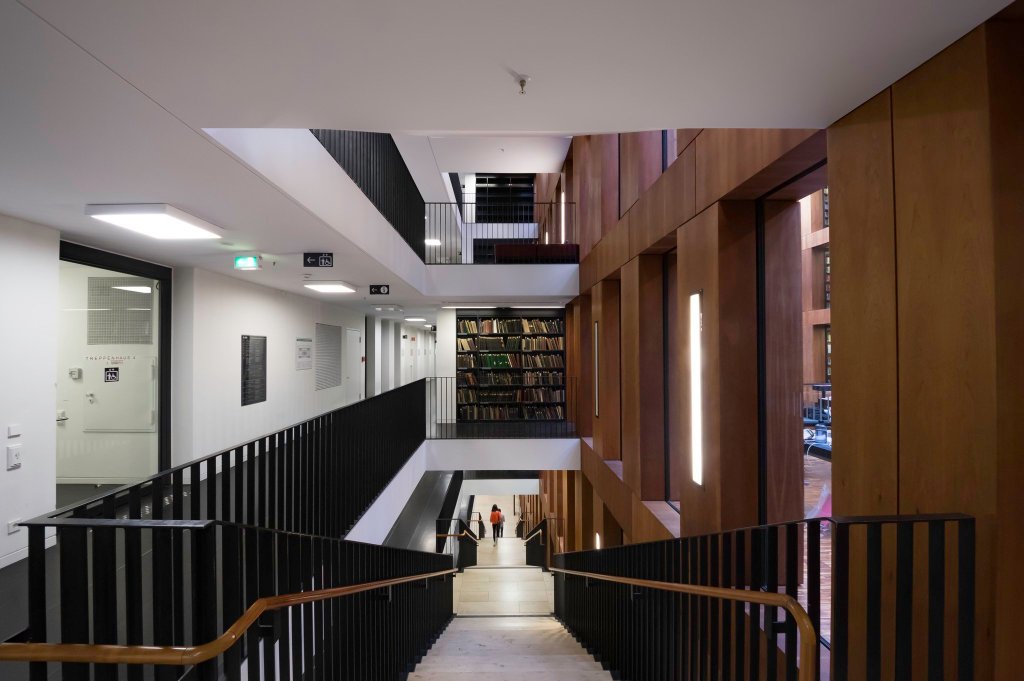
stairway in Jacob- und Wilhelm-Grimm Zentrum, HU Berlin
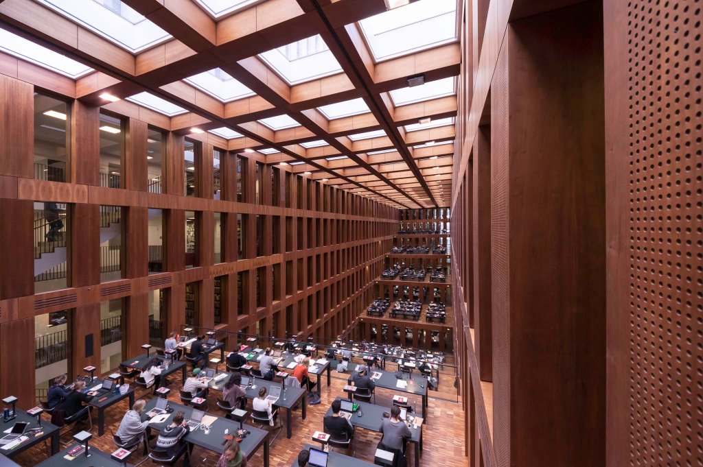
Atrium/work area at the central library of Humboldt University; Jacob- und Wilhelm-Grimm Zentrum in Mitte
Sadly though, while it looks stunning and creates some mesmerizing visual effects, this central library for Humboldt University does not make its users happy. In the beginning there were just a few hundred lockers located in a kind of narrow cul-de-sac. After heavy complaints they added a few more in the basement, which made them even harder to access. But that’s not all, another major problem are the acoustics. If you look at the pictures of the great hall with the open workspaces you can imagine, that sound carries very well in a space with that much volume. It creates so much resonance that you can clearly every time someone clears their throat.
DZ Bank, Frank Gehry
| Location: | Pariser Platz/Behrenstraße 73 |
| Purpose: | Offices, congress |
| Architect: | Frank Gehry |
| Completed in: | 2001 |
| Acreage: | 19.100 m2 |
Frank Gehry is one of only a couple of architecture superstars whose name nearly everyone has heard about, even if they don’t know what he does. Many of his buidlings share certain characteristics that make them easily recognizable. A lot of his houses have a metal facade that wrap around in organic waves, that look like nothing else. When he first introduced this type of construction he had to prove that it can be built at all, creating some patents on the way. What sets DZ Bank apart from other Gehry buildings is the classic, patterned structure of the side facing Pariser Platz. The whole ensemble of Brandenburg Gate, Pariser Platz and the surrounding buildings is a protected monument, imposing strict rules for the ration between window and stone. This led to some trickery by the French embassy and the Academy of Arts, who both found ways to circumvent these rules in a creative way. Not so Gehry, his design unfolds its magic only once you’re past the entrance. Which you can do, just ask.
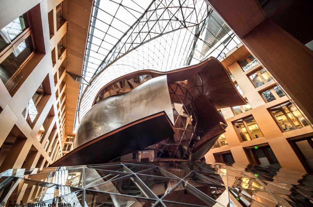
Ein Pferdekopf?
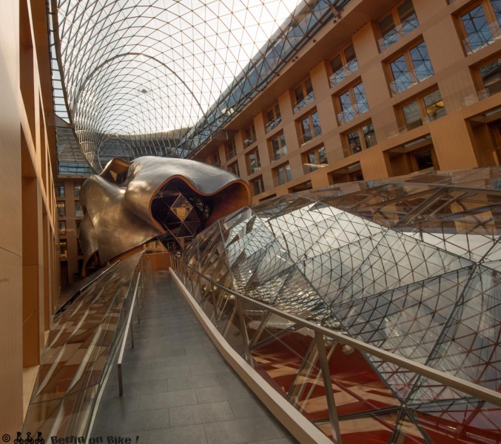

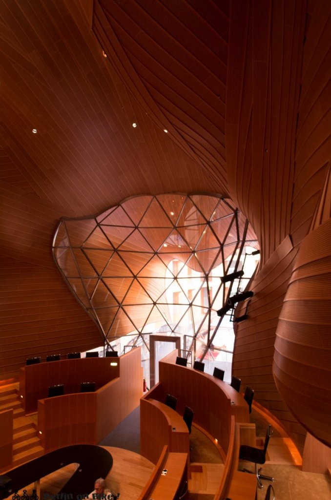
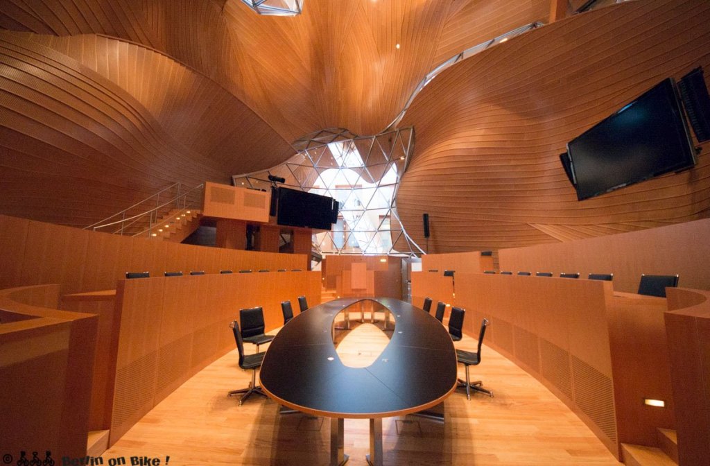
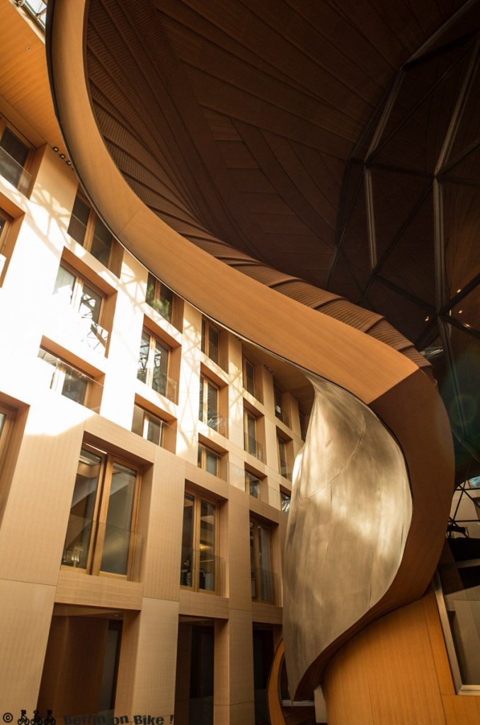
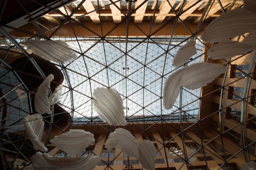
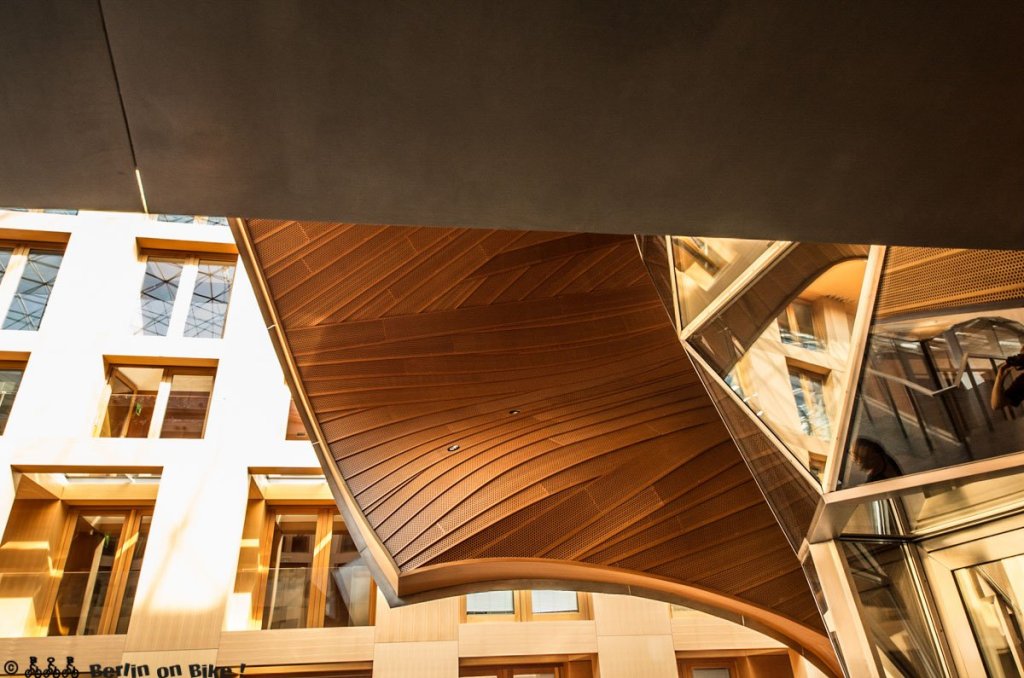
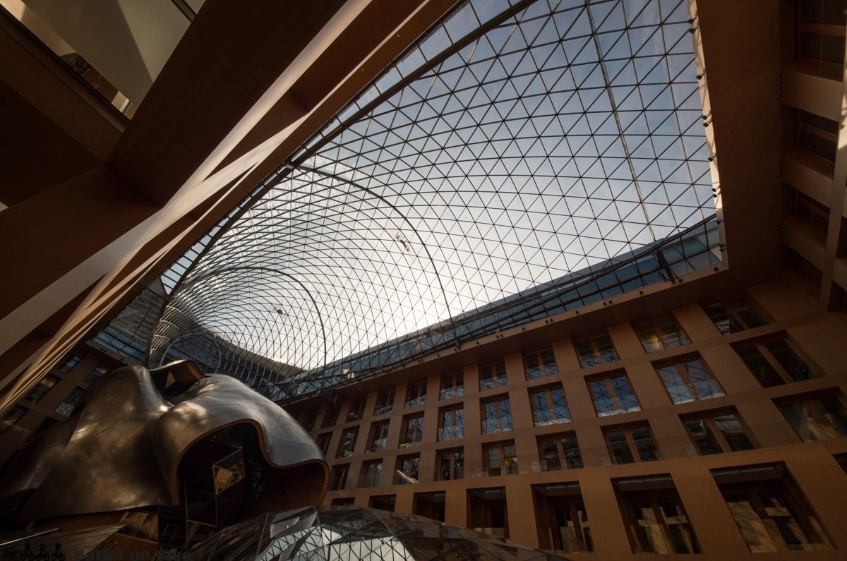
Once inside you stand in a huge atrium that goes all the way up to the roof. Inside that is another construction that beggars belief the first time you see it. A curved glass roof that looks a bit like a whale covers the underground congress centre and in the back is something that looks either like a horse’s head or a gladiator’s helmet, depending on who you ask. The surrounding offices get another facade facing the inside made of the same massive stone slabs that cover the outside. Inside this helmet is a high-tech, surveillance-proof meeting room for up to 60 people, which you can rent if you really need to discuss something in private. Even though everything is thoroughly modern, it is never cold or uninviting. Just the opposite in fact, I had to conciously refrain from touching all the surfaces. It is clear for DZ Bank this house is how they want to be seen and it’s a clear statement, they are doing well enough that they can afford to waste all this space in what is probably the most valuable real estate in Berlin. It literally doesn’t get any more exclusive.
If you’re able to read German, or don’t mind Google translate, we have an extensive blogpost just about DZ Bank
Deutsches Historisches Museum (DHM), I.M. Pei
| Location: | Unter den Linden 2 |
| Purpose: | Exhibition hall for DHM (the official history museum of Germany) |
| Architect: | IM Pei |
| Completed in: | 2001 |
| Acreage: | 9.300 m2 |
The thing about modern architecture and especially if it’s a public building, is that usually half the poeple think it’s an abonimation and start building castles again that someone else blew up 50 years earlier – and it usually takes more time and money than projected. The case of IM Pei’s exhibition hall for the offical German History Museum is totally different. After the unification it was clear that the two historical collections of East and “est need a new common place. The old arsenal (Zeughaus) that housed the GDR version alone was too small, so another building for the workshops and the temporary exhibitions was needed. Our than chancellor Helmut Kohl was a big fan of Pei’s pyramid in front of the Louvre so he asked him, if he would please take part in the upcoming competition. To which he received the answer “I’m too old for competitions, but I would be honored to build for you” (paraphrased). And because Kohl’s idea of the separation of power was, let’s just say, a bit dated, he declared that Pei is going to be the architect, just like he declared Norman Foster had to put a cupola on top of the Reichstag building, even though Foster won with a totally different design (another long, fascinating and funny story, I’ll tell you in detail another time).
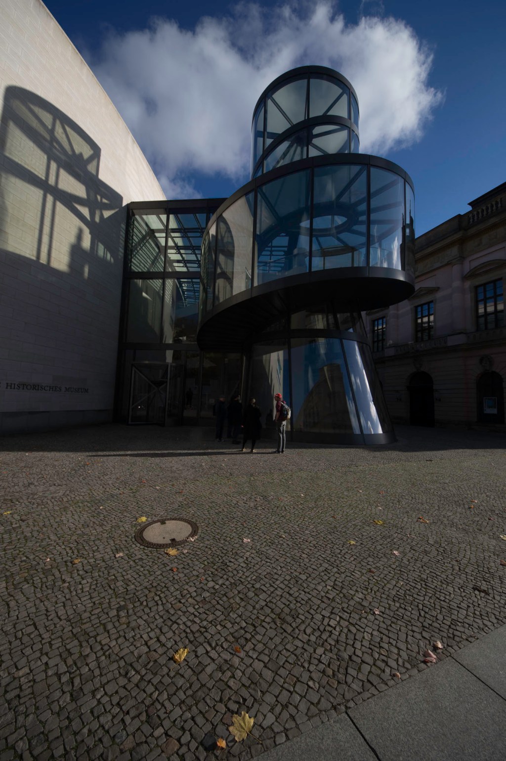
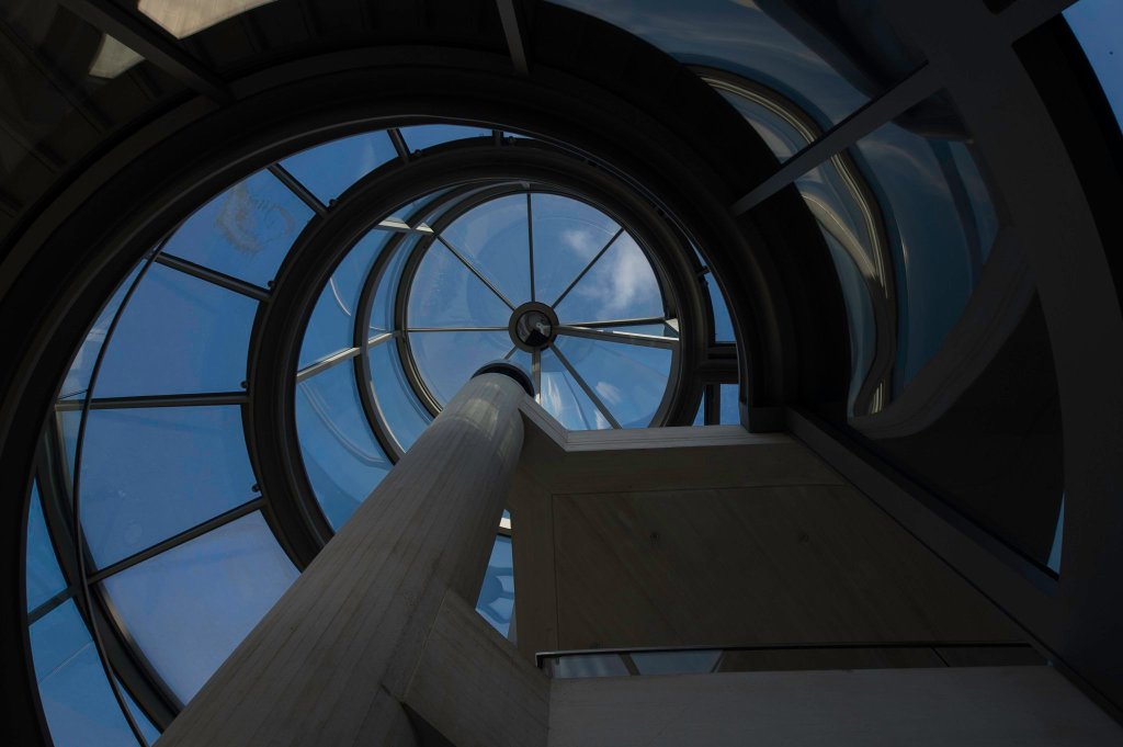
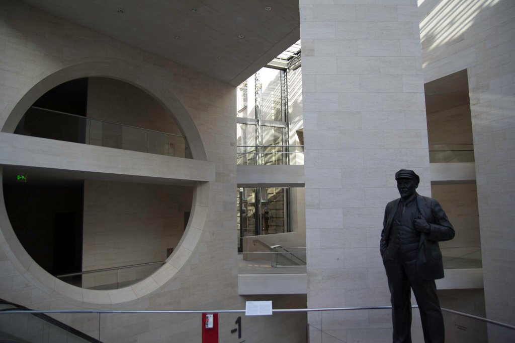
The building consists of three distinct parts, the entrance with the small glass tower, the workshops facing the river and the exhibition halls. There are stairs and walkways crisscrossing the atrium and connecting it with the rest of the museum in the arsenal (Zeughaus) blurring the lines between inside and out. Of course there were some minor scandals, like an echo that is way too long, to have concerts in the atrium as was originally planned, but it was finished in time and as far as I know mainly on budget. Even more wondrous was the fact that everyone liked it, that almost never happens; the press, the politicians, architects, bus drivers, you name it. The only exception was the creator. “I tried my best, but it wasn’t good enough” is what he said, according to a rumour right before he walked past the Berlin mayor to thank his employees before all else. On the other hand this might be just that a rumour, that fits well with the air of modesty Pei was excuding constantly.
Jewish Museum, Daniel Libeskind
| Location: | Lindenstraße 9-14 |
| Purpose: | Museum/academy |
| Architect: | Daniel Libeskind |
| Completed in: | 1999 |
| Acreage: | 20.000 m2 |
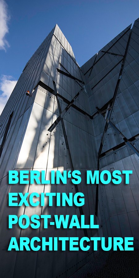
Absurdly enough Berlins first Jewish Museum was opened just days before Hitler was made chancellour and of course subsequently closed down. It consists of two buildings, a gorgeous baroque contraption that used to be a courthouse and Daniel Libeskind’s abstract chiffre for the Shoa, clad in titan and zinc, surrounded by gardens, art installations and a remodeled flower market that houses the academy on the other side of the street. One of the things Libeskind did extremely well here, was blending the old and the new. Seen from above the building zig-zags seemingly at random forcing a new perspective on you, walking through or around. Inside, three main axis shape the museum; the Axis of Continuity leading to the permanent exhibition, the Axis of Exile and the Axis of the Holocaust. Not all floors are really level and there are empty rooms going all the way through from the basement to the roof. These rooms are called “voids” and have no public access, like the voids left by the Nazi terror that killed our best and our brightest, and just about everyone else. All this combined creates a sensual experience, an architectural equivalent, if you will, of the history of Judaism.
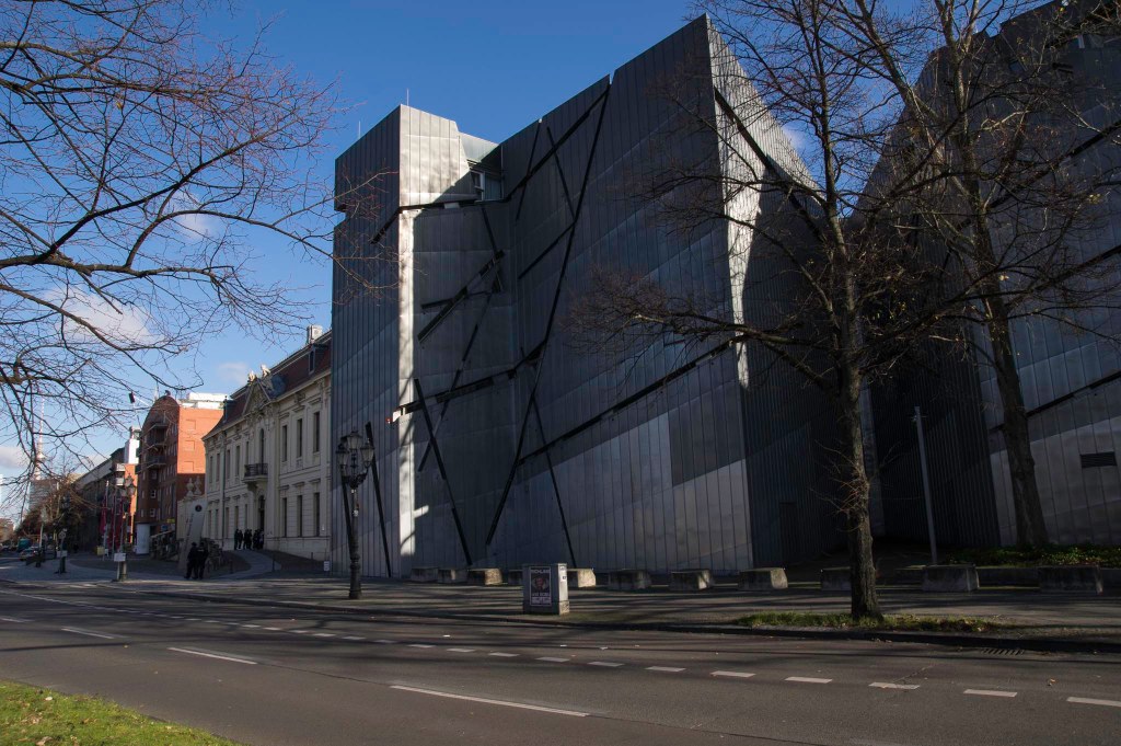
The metallic facade of Berlin’s Jeiwsh Museum in Lindenstraße. On the left you can spot the old building that is connected via an underground passage.
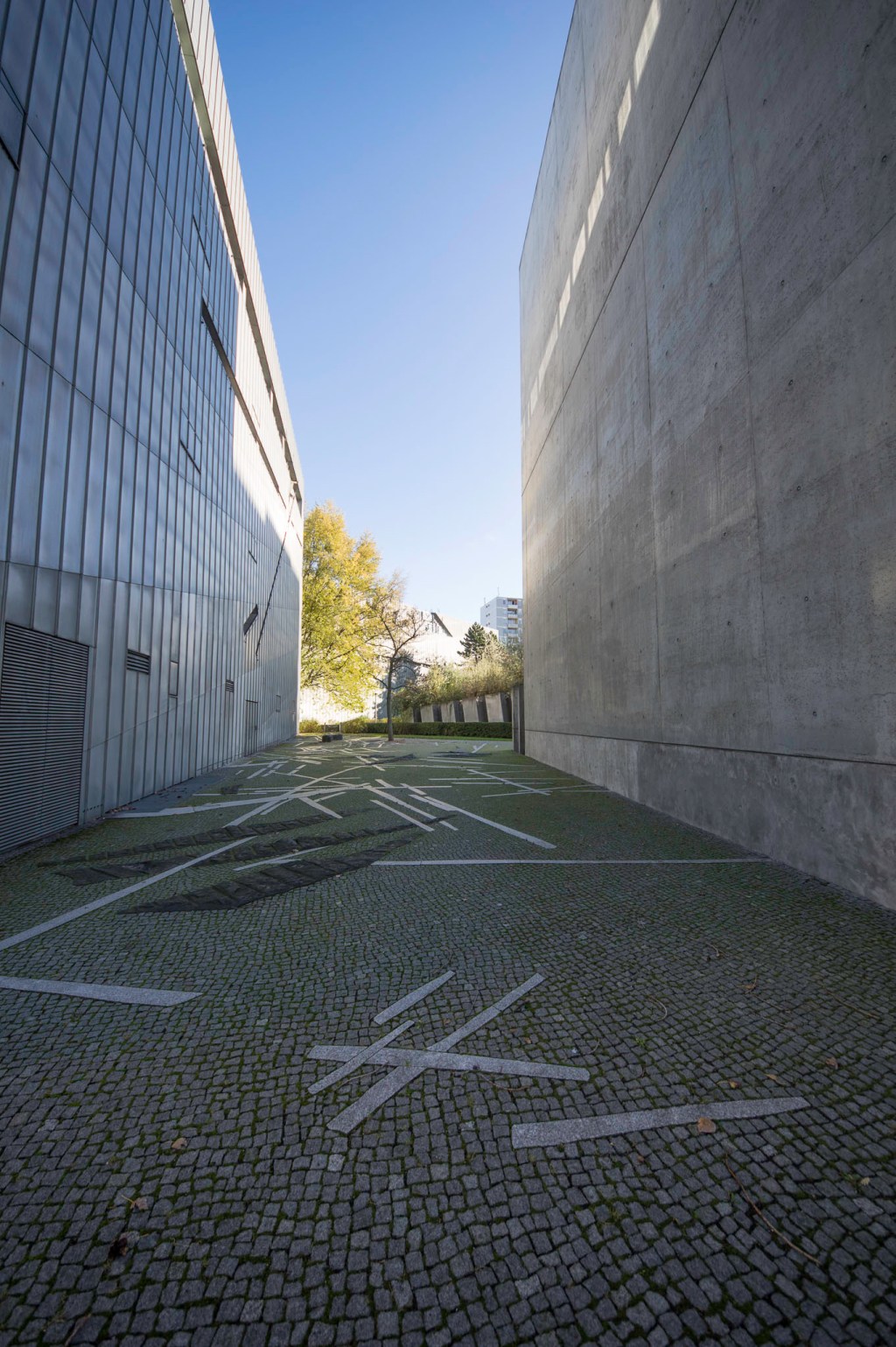
This courtyrad between the museum and the ‘Tower of Holocaust’ is dedicated to Paul Celan, a lyricist, that is most famous for his “Todesfuge” (death fugue).
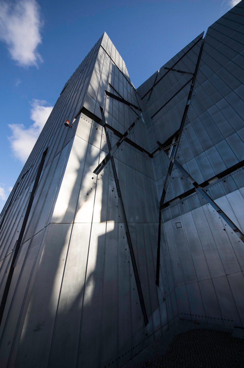
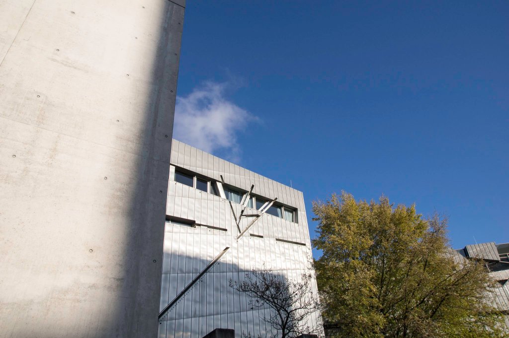
The windows on Libeskinds building for the Jewish Museum in Berlin look like they were cut with knife.

Garten der Diaspora in der Akademie des Jüdischen Museums.
Opened and awarded in 1999 the building is so overwhelming that on my first visit, I couldn’t really focus on the exhibition. In the years since they improved their presentation massively, so now the function is on-par with the outer form.
Libeskind is yet responsible for another remarkable building, the newly opened Sapphire right across from the BND Headquarters (Germany’s secret service). The facade is entirely clad in titanium coated ceramic tiles turning the whole building into a reflective landmark. Like the moon or a snow-tipped mountain it changes colour according to exterior light conditions. Sometimes turning it a dull grey, or giving it a bluish sheen on a clear cool day, just to let it blaze like molten gold right before the sun sets. The Sapphire is Libeskind’s first residential building in Europe.
NHow Hotel, Sergej Tchoban/Karim Rashid
| Location: | Stralauer Allee 3 |
| Purpose: | 4 star Hotel |
| Architect: | Sergej Tchoban (ext.)/Karim Rashid (int.) |
| Completed in: | 2010 |
| Acreage: | ca 400 rooms + conference centre |
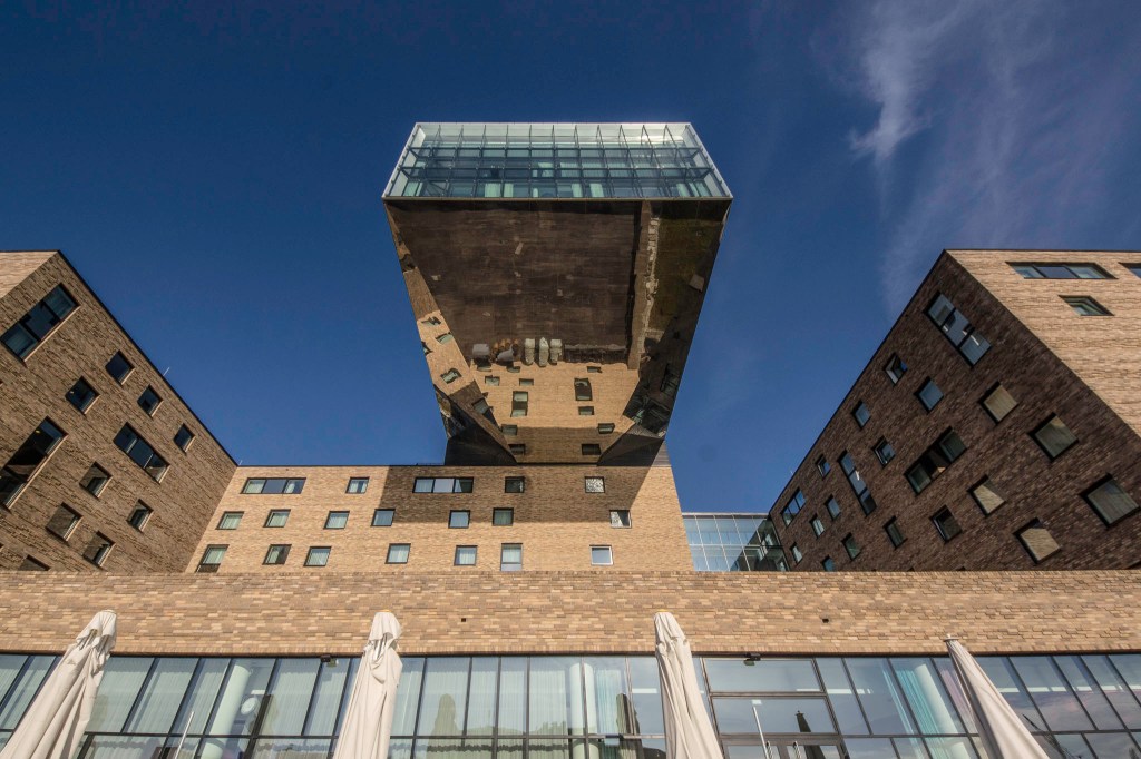
I must admit I struggled a bit to include this building here, because it is part of a wider and highly controversial development scheme, called Media Spree, which encompasses both river banks between Elsenbrücke and Schillingbrücke including the monstrosity that is now called Mercedes Benz Arena and the surrounding corporate neighbourhood dominated by Zalando and the Anschütz group. For a lot of the locals the fact that this whole area was given over to the highest bidders is quite the affront. Many were dismayed and (I’d like to think rightfully so) angry when part of the Eastside Gallery had to be taken down for a building with luxury appartments. The fight got rather juicy after it became public knowledge that the developer behind Living Levels was supposedly a former Stasi informant. But I have to admit, I really like the Tchobans music and style hotel at the river. While most of the construction consists of differently sized blocks clad in yellow bricks, 30m above the river a mirrored shoe box is levitating, reminding me a bit of an airship in the process of taking of. Both of those buildings have been created by Sergej Tchoban, who kind of has a knack for picking complicated projects, or maybe he is just fearless as Russians seem to be most of the time. In this case the finished building was vastly different from what was stated in the original permit, so maybe it’s not that trouble finds Tchoban, but Tchoban finds trouble. Anyway, I still really like his work. In 2013 his foundation opened a small museum about architectural drawings that looks like an Egyptian temple. Until we get around to take some pictures of our own, check out their website.
The interior of the place is the total opposite of the simple and clear lines on the outside. The interior architect Karim Rashid created a design-heavy feeling of oversized candy store. Lot’s of organic shapes and popping colours dominate the public areas, while the rooms are a bit more modest.
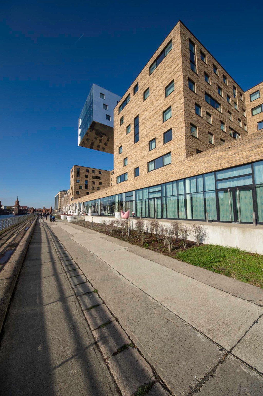
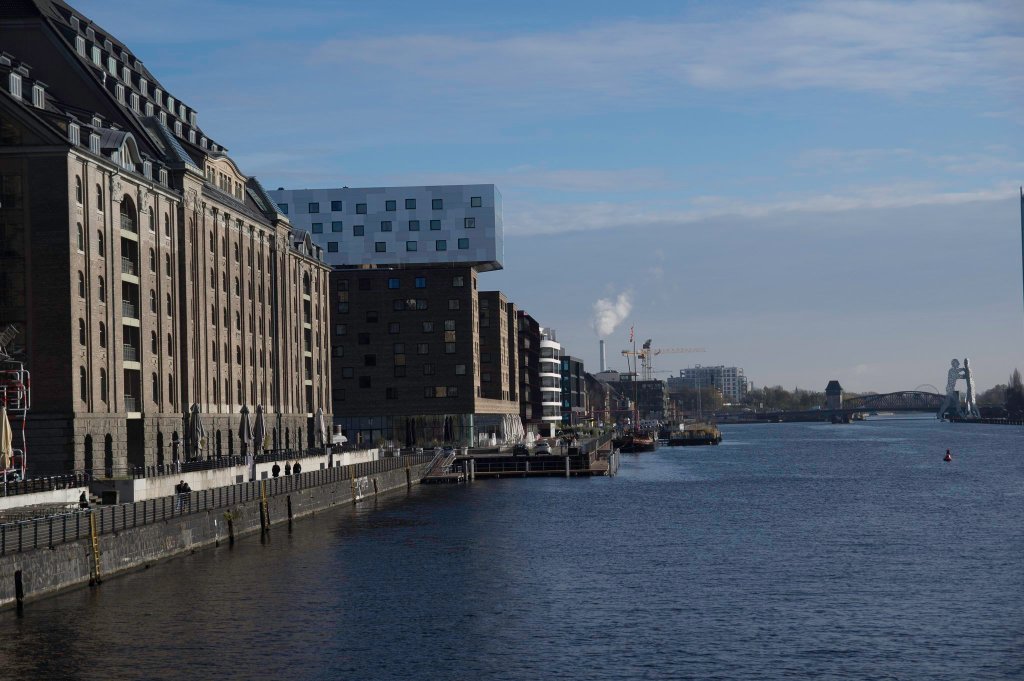
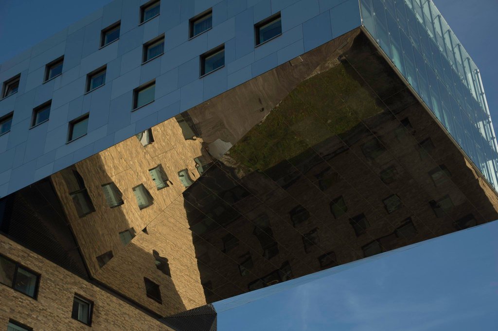
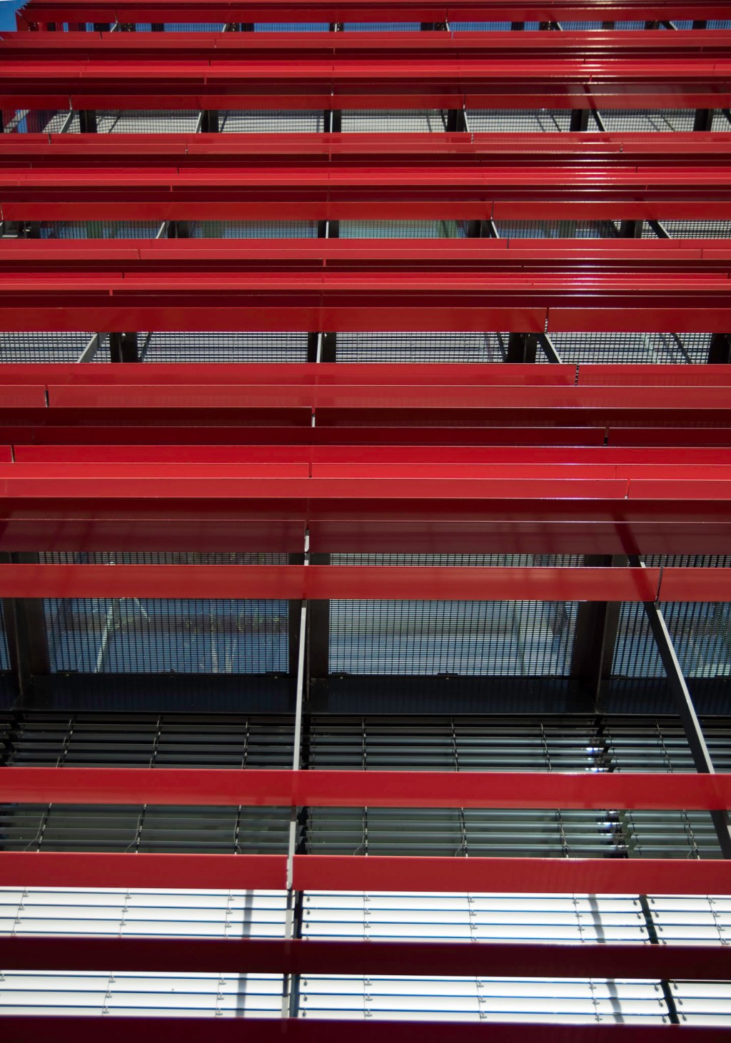
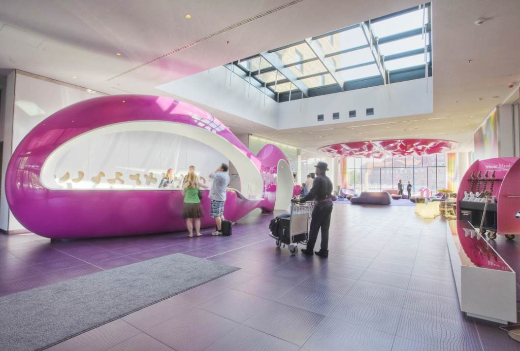
Interior photos provided by nhow Hotels. The house with red shades is Coca Cola Germany’s HQ next door, and I thought it kind of cute, but the architecture itself is a bit uninspired and doesn’t really deserve a stand-alone entry.
Galerie Bastian, David Chipperfield
| Location: | Am Kupfergraben 10 |
| Purpose: | 4 star Hotel |
| Architect: | David Chipperfield |
| Completed in: | 2007 |
| Acreage: |
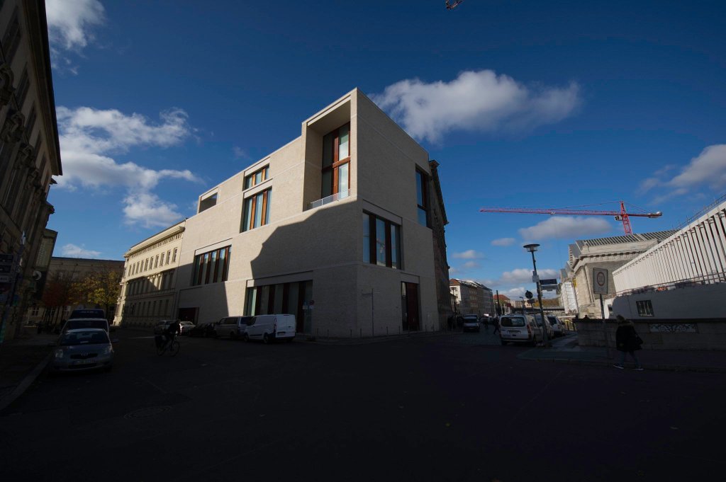
Compared to the other projects in this list, Chipperfield’s gallery for private art collectors the Bastian family seems a bit small and unspectacular. I did not include it because I am a fan of Chipperfield – which I am – but because I think he found an ingenious solution for a very difficult location. Located right on the other side of Museum Island it is surrounded by classicist giants dominated by huge columns and temple-like porticos. In my opinion he managed to cite the past by the choice of material (sandstone) and cubature, without going retro. It is an entirely modern building, that nonetheless doesn’t really stick out among in the middle of Berlins’s world heritage sites. Interestingly enough, Chipperfield is building the James Simon Galerie on the other side of the road right now, for which he chose a different approach, using modern materials and modernized elements that can be found elsewhere in the 5 museums, like collonades and wide, open stairs. We’ll update you, as soon, as we can get a good look at the finished product.
If you are interested in doing a bike-tour about architecture or specific aspects of Urban development drop us a line. We employ several professionals from those fields (I’m not one of them) that are happy to share their knowledge.

